Joe: heya, I’m super pleased to have this conversation with you. Can we start with an introduction – tell me what brings you to the world of designing board games?
Harriet: Hi! Thanks for asking me. I studied product design at university, went on to have a varied career and ended up doing a lot of graphic design. Then, I met my partner who is a computer game developer (ColePowered). He introduced me to board games that weren’t Monopoly, and I fell for both him, and the board games. Especially escape rooms and adventure-style games.
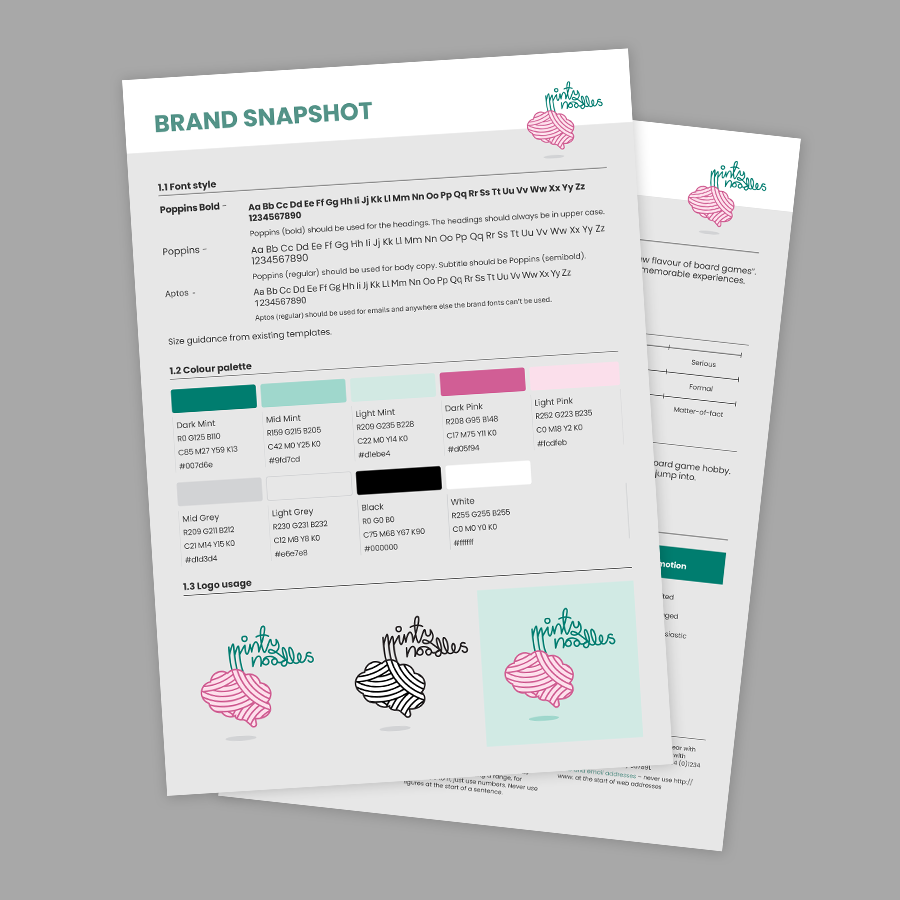
When we got the chance, Cole and I took the opportunity to create Minty Noodles and create our own game, Interstellar Adventures. Between his brain for mechanics and gameplay and my obsession for materials and design, I think we make a great game design team.
Joe: That’s brilliant, to meet two loves of your life at the same time is super lucky! Let’s start with a big question: why is graphic design in board games important?
Harriet: Graphic design is not just about aesthetics. It plays a huge role in the communication of the game. Good design can help quickly communicate rules, events and even atmosphere. It can help reduce the barrier of entry in learning a new game, reduce the frustration of referencing rules or even help build tension and create a dynamic table presence.
Making informed graphic decisions can also help make board games more inclusive and accessible
Making informed graphic decisions can also help make board games more inclusive and accessible to the widest possible audiences. Including, but not limited to, wider age demographics, people who are visually impaired, people with different language proficiencies, and people with dyslexia. This is something I think all designers should always have in mind.
Also, aesthetics. A good-looking game helps a lot to initially attract players, and (in my house at least) helps it earn a spot on my shelves.
Joe: I ran a poll on instagram recently about what attracts people to games, and the look is the first thing that so many followers said was the first draw to a game.
Can you give an example of your first point about graphic design’s role in communication?
Harriet: A few come to mind (probably because I was playing them recently). Subterra has reference card with stylised icons on them. They are really helpful for referencing game rules and events and manage to communicate a lot in a very small amount of space. It saved us from referencing the rule books a few times, which I always appreciate.
The Captain is Dead is one of my all time favourites. They use graphic design brilliantly. For directing the game set up, to rules reference but also by simply changing the colour of the backside of the alert cards as they become more and more nasty (from yellow, to orange, to red). This indicates to players a sense of building danger and suspense. A design decision that most definitely adds to the game play.
Joe: I’ve not played either of those games, so I’ll be sure to check them out! You mentioned the importance of design for inclusivity – do you have some advice you can give people about this, and it would be great to hear about the choices that you’re making in your own games that support this.
Harriet: My very general advice would be to playtest with lots and lots of people. Pay attention to what people are saying, and what they are not. Are they having trouble reading some of the writing? How are they holding the cards? There are also many resources out there, which can help you choose more suitable fonts and check colour contrast. This article might be a useful starting point: https://www.charitycomms.org.uk/core-principles-for-accessible-design-in-print
In Interstellar Adventures, we ended up having to change key elements of the story line to help with inclusivity. We had some puzzles that were entirely colour based. We decided to change the story and axed some of the puzzles to make it more accessible to people with colour vision deficiency.
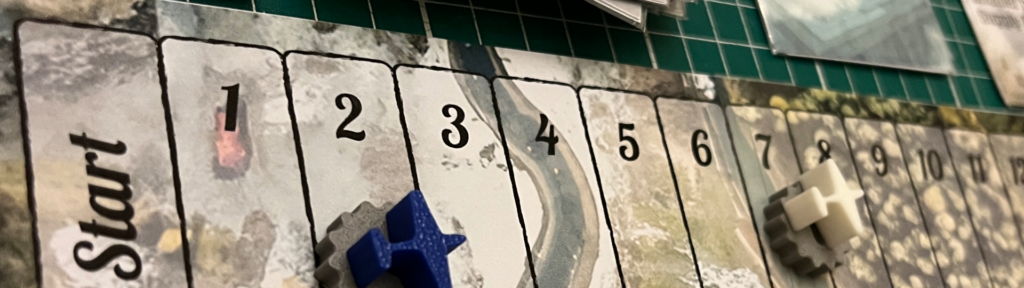
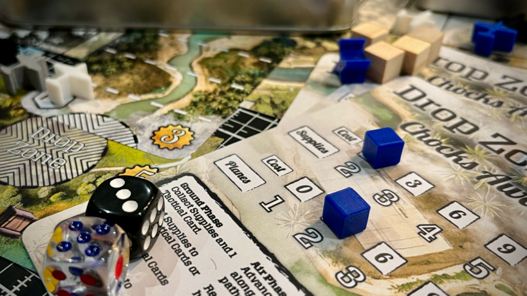
Joe: That’s really useful guidance – I’ll make sure to check out the resources as I continue development of Drop Zone.
There’s a lot of indie designers out there, with many ideas for games that might never see professional graphic design work. I wonder if we could explore some basic principles of graphic design that might support those sorts of people?
Harriet: That’s a tough one. Graphic design is valuable. In my opinion it’s worth spending the money on, or the time to train yourself. Everyone has to learn at some point and, with so many tools, resources and sources of inspiration there has never been a time when graphic design is more accessible, for better, or worse (I see some pretty questionable things out there). The golden rule – LESS IS MORE.
You do not need 7 colours, 4 fonts and 6 bits of clipart in one page. In fact, clip art is banned. Pick a colour palette with complementary OR contrasting colours. You should never need more than 3 fonts, try and keep it to 2. Choose images that are impactful and don’t just add things to fill space.
There are so many resources out there. I have added a few here which might be useful:
Fonts:
Colour Pallettes:
Images/vectors/mockups:
Icons for EVERYTHING:
General design inspiration:
Having said all this, keep in mind that hiring a designer is something you should really consider if at all possible. A graphic designer can make all the difference. Its obvious when someone has spent money on the artwork and scrimped on the design elements. It’s such a shame. Practically, they can also save you time and money too. Data merges are a powerful tool that can help produce cards quickly and make changes and localisation easier. Also, we are trained to have a detailed eye and experience with documents for print, so we know how to avoid the most common print mistakes.
But… I would say that wouldn’t I.
Joe: that’s a brilliant, useful set of resources. And you’re 100% correct that, ultimately, getting high quality graphic design will improve the quality of everything you might produce around a game.
I wonder if we might dive into an idea in more detail, what’s the set of stuff that you might need in terms of graphic design: you mentioned fonts and colour palettes, what else should we be thinking about?
Consistency is key. Building brand recognition helps your audience to identify your content.
Harriet: Consistency is key. Building brand recognition helps your audience to identify your content. It might be tempting to do something new and different because you have seen the same colour/font/border for a long time. Remember, most people won’t see everything you do and when they do its amongst a lot of other noise. Staying consistent in your imagery, colour palette, font and tone of voice will help your audience pick out your content, recognise your updates and engage with content that resonates with them.
Joe: that’s a super interesting point most people won’t see everything you do. I think this was a key learning for me, especially on social media. For me, it points to consistency, but also makes me feel it’s ok to make mistakes because most people will never know the mistakes happened!
Let’s finish with a little more about you – what are your working on at the moment and what sort of graphic design choices are you making?
Harriet: Interstellar Adventures is our new adventure/puzzle game. Think escape room board game but with dexterity games, board game mechanics and choose your own adventure decisions, as well as puzzles. I have found the graphic design for this project to be incredibly fun and challenging. The game has to guide players as they go along, with little to no reference to a rule book. The game also needs to reassure the player they are in the right track, without feeling like spoilers or ‘hand-holding’. Therefore, the graphic design has to be very clear and concise. I have also been keen to incorporate the materials or the components themselves into the puzzles, which has involved some printing and manufacturing knowledge to create something possible, and not outrageously expensive to produce. We are coming towards the end of our development phase now and I think we have something that is starting to work well, something that is… fun! (Which is a relief!)
A specific choice that I’m making, that I think might be helpful to others is to bring some of the texture of the illustrations in the game into other components. Our game has a vintage sci-fi vibes, the artist added ‘noise’ and texture to the illustrations. I have taken the same noise and texture and used it on the icons and background of the cards. This helps to pull the illustrations and designs together.
Thanks to Harriet for her time and expertise. You can find Minty Noodles on Instragram.
If you’re looking for more great stories from indie designers, check out the blog archive, subscribe to get updates for new post, and come and find me on instagram.